Free Online Org Chart Maker (Build One in 5 Minutes)
Every small business ends up needing an org chart at some point — for a new hire, an investor deck, or just to settle an argument about who reports to whom. You don't need HR software for this. A free online org chart maker gets you a clean, accurate chart in about five minutes, and I'll walk through exactly how I build one for client teams.
Quick answer
A free online org chart maker is any canvas-based diagramming tool that lets you place boxes for roles and connect them with lines to show reporting structure — no paid software required for a basic chart. Build top-down, one layer at a time, label by role first and name second, and export or share a live link when you're done.
Why you don't need paid software for this
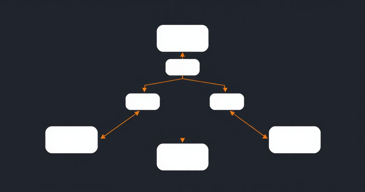
Org charts are boxes and lines. That's genuinely the whole technical requirement. The paid HR platforms that market "org chart software" are selling directory sync, automatic updates from your HRIS, and reporting features — valuable at 200 employees, unnecessary at 15. For a small B2B team, a canvas tool with basic shapes and connectors, used well, produces a chart that's just as clear.
I've built dozens of these for client teams during onboarding audits, almost always in a free tool, because the client doesn't need to buy anything new just to answer "who reports to whom."
Building one in five minutes
- Start with one box at the top. Founder, CEO, or department head — whoever sits at the top of the structure you're mapping. Don't try to lay out the whole chart before placing this first box; it anchors everything else.
- Add the next layer directly below, connected with a line. These are direct reports to the top box. Space them evenly; most canvas tools will auto-align if you drag close to an existing box.
- Repeat one layer at a time. Resist mapping multiple layers simultaneously — it's how charts end up crossed and unreadable. Finish a full layer, then move down.
- Label by role, then name. Put the job title as the primary text and the person's name smaller underneath. If someone leaves, you update one line instead of redrawing the box.
- Color-code by department once you're past 10-12 boxes. This is the single change that makes a mid-size chart scannable instead of a wall of identical rectangles.
- Share a live link rather than exporting a static image, if your tool supports it — that way the chart reflects reality even if someone updates it after a hire.
A structural mistake I see constantly
Teams build the org chart to reflect an aspirational structure — the one in the strategy deck — rather than who's actually managing whom day to day. That gap causes real confusion when a new hire tries to figure out who to ask for a sign-off. Build the chart to match reality first. If you want an aspirational future-state chart too, label it clearly as one and keep it as a separate board, not layered into the current chart.
Org chart vs swimlane diagram
These get confused. An org chart shows static reporting structure — who manages whom. A swimlane diagram shows a process flowing across roles over time. If you're trying to document "who does what when a deal closes," you want a swimlane, not an org chart. If you're trying to document "who reports to whom," you want the org chart. Using the wrong one is a common reason process documentation projects stall — see flowchart vs process map difference for the related distinction on the process side.
Comparison: free org chart tools
| Tool | Free tier limits | Best for |
|---|---|---|
| EvronStudio boards | Generous canvas size on free tier; org chart lives alongside your actual team/project records | Teams who also want the chart connected to real client and project data |
| Canva | Free templates, easy styling, good for investor decks | Purely visual — no connection to any underlying team data |
| Lucidchart | Free tier caps at a small number of documents/shapes | Precise diagramming with strong export options; see our full Lucidchart alternative comparison |
| draw.io | Fully free, no account required, unlimited shapes | No collaboration or sharing layer without extra setup |
| Google Slides/Docs | Free, familiar, fine for very small teams | Manual box-drawing gets tedious past about 10 people |
When free tools stop being enough
Past roughly 20-30 people, manual org charts get error-prone — someone's promoted, the chart isn't updated, and now new hires are asking the wrong manager for approvals. At that scale, HR platforms with directory sync (BambooHR, Rippling, and similar) that auto-generate the chart from your actual employee records are worth paying for. Below that size, the manual free-tool approach is genuinely faster and gives you more control over layout and presentation.
Where this fits into a bigger picture
If you're mapping your org chart as part of a wider effort to document how your business runs — reporting lines plus process flows plus client handoffs — it's worth doing all three on the same platform so they stay consistent with each other. Process mapping software for small business covers the process side, and all-in-one CRM and project management covers what it looks like when your org structure, client records, and delivery work all reference the same underlying data instead of living in separate exported files that quietly drift apart. For a wider tour of diagramming tools generally, see the best diagramming tools in 2026.
Frequently asked questions
- Is there a genuinely free way to make an org chart online?
- Yes. Most canvas-based diagramming tools, including EvronStudio's board editor, let you build an org chart for free with boxes and connector lines — no paid tier required for a basic chart under roughly 20-30 people.
- What's the fastest way to build an org chart from scratch?
- Start at the top with one box for the most senior role, then work down one layer at a time, connecting each manager to their direct reports before adding the next layer. Building layer by layer is faster than trying to lay out the whole chart at once.
- Should an org chart show names or just roles?
- Roles first, names second. Org charts built around names go stale the moment someone leaves or is promoted. Put the role as the primary label and the name as a smaller secondary line, so the chart's structure survives personnel changes.
- Can I export an org chart to share with clients or investors?
- Yes, most tools including EvronStudio let you export a board as an image or PDF, or share a live view link so viewers always see the current version rather than a snapshot that goes out of date.
- What size company outgrows a free org chart tool?
- Free tiers typically start to strain past 20-30 people, either on canvas size limits or export restrictions. Above that, dedicated HR org-chart tools with directory sync become worth the cost because manual updates get error-prone at scale.
About the author
James Whitfield writes for EvronStudio on diagramming & boards for small B2B teams. Meet the editorial team.
Part of our guide to Process Mapping Software for Small Businesses: What Actually Matters.
Keep reading
Swimlane Diagram Maker: Map Who Does What, When
A swimlane diagram maker built for cross-team handoffs, not enterprise BPMN. See how to build one, real examples, and tools compared honestly.
Diagramming & BoardsSales Process Flowchart Templates You Can Copy Today
Ready-to-copy sales process flowchart templates for B2B teams: outbound, inbound, and enterprise deal cycles, with what to customize.
Diagramming & BoardsProcess Mapping Software for Small Businesses: What Actually Matters
A practical buyer's guide to process mapping software for small business — what to prioritize, what to skip, and how the top tools compare.